What does Wine Vintage Mean?
What does Vintage mean?
Have you ever gone into a wine store and noticed that there are two bottles of the exact same wine, but one is significantly more expensive than the other? Then you notice that while they look exactly the same, they’re actually from two different vintage years. It doesn’t make sense that the year in which a wine was bottled can affect the price of a bottle that much, right? Well, if you tasted them side by side, they wouldn’t taste exactly the same. How is this possible? Don’t wine makers have wine making processes and procedures that they’ve cultivated and honed for decades, until they produce their signature and hallmark wines? Of course they do, but what they can’t control is Mother Nature.
Year to year
The weather has a huge impact on the grapes that are produced in a given year. If it’s a particularly cold or wet year, then the grapes won’t ripen all the way by the time harvest arrives. That affects everything about the wine that those grapes make – you might find that particular vintage to be not as balanced as other years. If you were to compare and taste two of the same wines from different vintage years side by side, you would absolutely be able to tell a difference, particularly if they were from drastically different years. For example, a bottle of 2011 Napa Cabernet will not be the same as the same bottle from the following year’s grapes. 2011 was a particularly cold and wet year in the Napa Valley, and as such, the resulting wines have been reviewed to be equally as mediocre. For example, Wine Enthusiast Magazine’s Vintage Chart gave the 2012 Cabernet Sauvignon from Napa Valley a rating of 95 (“Superb”), while 2011 only received an 89 (“very good”). I’ll get into vintage charts in a bit, but that is a great example of a particular varietal and region where the weather had an incredible impact on the quality – and the ratings – of a producer’s bottles.
[wordads]
Vintage Charts
You may have seen people pull these out of their pockets at restaurants as they pore over the wine list, and use it as a reference point as they debate with the sommelier. This is what has given Vintage Charts a bad name – stuffy and unnecessary. That might be true in part, but I like them. I think vintage charts have their place, as a generic reference guide. I find them fascinating to look at. If you use it as a basic reference, you can learn a lot about which regions you should look for in particular years. It’s also helpful when looking to buy wine for investment – which years will likely turn a higher profit down the road?
 This is an example of a Vintage Chart, one that Wine Enthusiast published for 2015. Click to learn more.
 How to read it
There is a myriad of sources that publish their own vintage charts yearly: Wine Enthusiast, Wine Spectator, Robert Parker, and others. What you’ll usually find is all of the major wine producing regions of the world listed down the left side, with their major grape varietals as sub-categories. Across the top are vintage years, beginning with the most current, sometimes dating back decades. Depending on who published the chart, they might color code them differently, but the information is generally the same. As I said before, they’re great to use as a reference point, but shouldn’t be taken as law. They don’t account for personal preference, or individual wine maker ability. Returning to my example above, about 2011 in Napa Valley: most sources refer to 2011 in Napa as a “challenging year,” and you see that reflected in scoring. It is important to remember that this does not mean that all 2011 wines from Napa Valley were bad. In fact, it probably means that you can find some great deals! When the weather is sub-par during a particular season, and the growing conditions are not optimal, the ratings will reflect that. Just remember that in these cases, you should look far past vintage charts and do your own tasting to find out what’s good and what’s not for yourself!
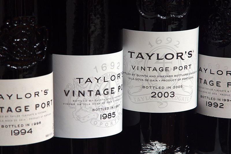
[bctt tweet=”The best way to really understand the difference between vintages is to taste them side by side” username=”TheFinestItali1″] – we call this a vertical tasting, and it’s one of the best ways to use your Coravin System. When else are you going to be able to taste through six or seven (or more) years of a single producer? So grab your Coravin, and pick up a few years of your favorite wine, and start comparing!
Credit: Coravin and Wine Enthusiastic
Discover more from The Finest Italian Wine
Subscribe to get the latest posts sent to your email.